A utility bill functions as more than a mere invoice; it acts as a secondary form of identification that bridges the gap between a digital persona and a physical residence. While a passport or ID card verifies the identity of the person, the utility bill anchors that identity to a specific geographic point. This relationship is the cornerstone of why institutions—and by extension, the software designed to verify them—treat the layout of these documents with such high scrutiny. Understanding this architecture is essential for anyone in the fields of film production, game development, or KYC software testing.
The structural evolution of utility bills has been dictated by the dual requirements of machine-readability for automated sorting and psychological clarity for the consumer. In the early days of billing, documents were simple ledger printouts. Today, they are sophisticated data visualizations designed to be parsed by Optical Character Recognition (OCR) systems in milliseconds. When a layout deviates even slightly from expected industry standards, it triggers red flags in verification algorithms, regardless of the document’s aesthetic quality.

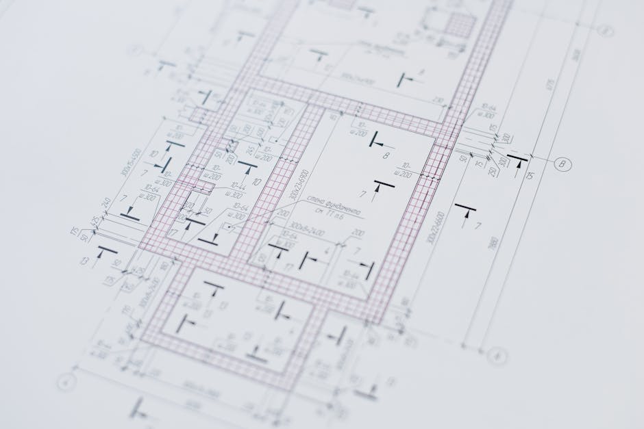
The Anatomy of a High-Trust Utility Document
The ‘Anchor Zone’ of a utility bill is the most critical structural element, typically located in the top third of the document to align with the transparent windows of standard mailing envelopes. This area contains the recipient’s name and address, the service address (which may differ), the account number, and the statement date. For verification purposes, this is the first place a human or a machine looks. The alignment here must be precise, as OCR software is programmed to look for specific “bounding boxes” where these data points are expected to reside.
Modern utility bills utilize a specific hierarchy of information where the total amount due and the due date are emphasized through bold typography or contrasting colors to ensure immediate recognition. This is not just for the customer’s convenience; it creates a consistent visual pattern that verification systems use to orient the rest of the document. If the “Amount Due” is placed in an unconventional corner, the layout loses its perceived legitimacy, even if the information itself is accurate. This structural “muscle memory” of the document is what creates the sense of authenticity.
The Logic of Data Redundancy
A genuine utility bill is defined by its internal logic and data redundancy, where consumption metrics, meter readings, and billing periods must mathematically align across several sections. If a bill shows a 30-day service period but the meter readings suggest a 60-day consumption pattern, the document fails a “sanity check.” Professional document designers, such as the editorial bureau at John Wick Templates, emphasize this 1:1 recreation of logical flow, ensuring that every calculated field—from VAT/tax additions to standing charges—reflects the real-world math used by actual utility providers.
Unique identifiers like the Service Point Identifier (SPID) or Meter Point Administration Number (MPAN) provide a layer of technical authenticity that generic templates often overlook. These codes are not random; they follow specific regional formats and checksum algorithms. Including these details in a layout shows a deep understanding of the utility infrastructure, which is vital for high-stakes environments like film props where a close-up shot could reveal a lack of technical depth.
Why OCR Systems Care About Layout Geometry
Optical Character Recognition (OCR) technology does not just read text; it maps the ‘white space’ and geometric relationships between different blocks of information to verify document integrity. Verification engines use templates of known utility providers to compare the distance between the logo and the address block. If the logo is three millimeters too low, the confidence score of the automated check drops significantly. This is why layout “precision” is often more important than the “look” of the paper itself.
The use of ‘Guilloche’ patterns, micro-text, and complex grid alignments in the background of bills serves as a deterrent against low-quality digital manipulation. While we often think of these as features for banknotes, many top-tier utility providers use subtle watermarks or non-reproducible tints in their PDF and physical outputs. Recreating these elements requires high-fidelity PSD assets that can handle multi-layer adjustments without losing the underlying structural integrity of the security patterns.
Font Selection and Kerning Logic
Utility companies typically use proprietary or highly specific sans-serif fonts like Helvetica, Arial, or custom corporate typefaces that are optimized for high-speed industrial printing. The kerning—the space between letters—in these documents is often slightly tighter than standard word processing software. When a layout uses a generic font like Times New Roman for a modern electric bill, it creates an immediate visual “uncanny valley” effect that signals the document is a replica. Professional assets must mirror the exact weight and spacing of these industrial fonts to pass visual inspection.
Regional Variations in Billing Structures
Utility bill layouts vary significantly by jurisdiction, with European bills often featuring prominent VAT breakdowns and IBAN details, while North American bills focus on tiered pricing structures and ‘Remittance Advice’ stubs. In the United Kingdom, for instance, a bill without a clear breakdown of the “Standing Charge” and “Unit Rate” looks fundamentally incorrect. Conversely, a US-based bill often includes a “Comparison Graph” showing the last 12 months of usage, a feature that is essential for the document’s layout “weight.”
The ‘Remittance Advice’ or ‘Tear-off Slip’ at the bottom of a bill is a structural vestige of the physical mail-in payment era that remains a requirement for document authenticity today. This section often repeats the account number and amount due in a specialized OCR-B font, which is designed specifically for machine reading. The presence of this “redundant” bottom section is often what separates a professional-grade prop or testing document from a generic placeholder.
Addressing Logic: The USPS/Royal Mail Standard
The way an address is formatted within the layout must follow the postal standards of the issuing country, including specific abbreviations and the placement of the postal code. A bill that places the postal code before the city in a country where it should follow the city is an immediate giveaway. Furthermore, the alignment of the address must be “left-justified” with a specific margin that allows for the automated barcodes used by postal services to be printed in the surrounding white space.

The Psychology of Document Trust
Trust in a document is built through the accumulation of ‘low-value’ details that, when combined, create a sense of institutional permanence. These details include the tiny “fine print” on the back of the bill, the specific shade of “past due” red, and even the quality of the company logo’s vector lines. For developers creating digital environments or testing KYC systems, these small cues are what prevent “immersion breaking” or system failures.
The presence of 2D barcodes or QR codes on modern bills has changed the layout landscape by adding a high-density data anchor that links the physical document to a digital record. These codes often contain a serialized string of the account data. If the text on the bill says one thing but the QR code (if scanned) would theoretically say another, the layout’s internal consistency is compromised. In professional testing scenarios, these codes must be thoughtfully integrated into the design rather than slapped on as an afterthought.
Use Cases for High-Fidelity Utility Layouts
In the world of game development, realistic utility bills are used as ‘environmental storytelling’ tools that ground the player in a believable, lived-in world. A character’s apartment filled with overdue notices and detailed electricity bills tells a story without a single line of dialogue. For these assets to work, they cannot look like generic “clipart”; they need the grit, layout, and technical detail of the real world.
Film and television production requires ‘hero’ props that can withstand high-definition close-up shots without revealing their nature as recreations. When a protagonist discovers a hidden address on a utility bill, the camera often lingers on the document. Any flaw in the guilloche patterns, font choice, or layout geometry could pull the audience out of the narrative. This is where high-quality PSD templates with editable layers become indispensable for prop masters.
For software developers building KYC (Know Your Customer) or AML (Anti-Money Laundering) systems, high-quality bill recreations are necessary for ‘stress-testing’ OCR algorithms against various edge cases. Developers need to know how their system handles slanted text, low-contrast backgrounds, or unusual regional layouts. Having a library of structured templates allows for the creation of diverse datasets that improve the machine learning models’ accuracy in the real world.
The Technical Burden of Precision
Recreating a utility bill from scratch is a massive technical undertaking that requires balancing aesthetic design with the rigid ‘grid logic’ of industrial documents. Most people underestimate the complexity of a utility bill until they try to align the consumption columns perfectly. This is why many professionals turn to specialized bureaus that understand the intersection of graphic design and document security.
A high-quality PSD template should offer non-destructive editing, allowing the user to change the data without breaking the underlying layout constraints or font hierarchies. This means the “Total” column should stay aligned even if the numbers change, and the “Address” block should remain within its OCR window. This level of “smart” design is what distinguishes a professional asset from a basic image file.
Summary of Structural Requirements
- Data Hierarchy: Clearly defined zones for identity, consumption, and payment.
- Mathematical Integrity: All figures must sum correctly and match the service dates.
- Geometric Accuracy: Alignment with postal windows and OCR bounding boxes.
- Typography: Use of industrial, high-speed print fonts with correct kerning.
- Regional Logic: Adherence to local tax, postal, and utility regulations.
Ultimately, the layout of a utility bill is a visual language of authority; mastering that language is the key to creating documents that are indistinguishable from those issued by major institutions. Whether you are a filmmaker or a software tester, the “why” behind the layout is just as important as the “what.”
For those requiring the highest level of precision in their digital assets, John Wick Templates provides the industry standard in 1:1 document recreations. Their focus on micro-printing, authentic fonts, and complex layout grids ensures that your project—whether it’s a cinematic masterpiece or a robust software suite—maintains the highest level of visual and structural integrity.
Frequently Asked Questions
Why do utility bills use such specific fonts?
Utility companies use specific sans-serif fonts to ensure that their high-speed industrial printers can produce legible text at small sizes. These fonts are also chosen to be easily readable by OCR systems used by banks and payment processors for automated data entry.
Can a layout affect whether a bill is accepted for verification?
Yes. Most automated verification systems use “template matching.” If the structural elements like the logo, address, and date are not in the expected locations for that specific provider, the system will likely flag the document for manual review or reject it entirely.
What is the most common mistake in utility bill props?
The most common mistake is “logical inconsistency.” This happens when the dates of service don’t match the billing period, or the mathematical total of the individual charges doesn’t equal the final amount due. These errors are easily spotted by both human reviewers and automated systems.
Do utility bills have security features?
While they don’t have holograms like passports, many bills use subtle security features such as micro-text, specific guilloche patterns in the background, and unique 1D or 2D barcodes that encode account information to prevent simple tampering.
How do I choose the right layout for a film prop?
Always choose a layout that matches the geographic location of your story. A US electric bill looks fundamentally different from a French or German one. Pay attention to the “tear-off” section at the bottom, as this is a key visual marker for audiences in different regions.
Leave a Reply