When you hold a physical payslip or open a digital salary statement, you are looking at more than just a summary of earnings; you are viewing the output of a complex intersection between accounting logic and graphic design constraints. The visual architecture of a payslip is dictated by the limitations of the payroll software’s rendering engine rather than pure aesthetic choices. For professionals in film production, game development, or KYC (Know Your Customer) software testing, understanding the nuances between a generic software export and a document that looks “real” is the difference between a jarring immersion-breaker and a seamless experience.
Most people assume a payslip is a standardized document, but in reality, there is a massive delta between what a modern SaaS platform like Gusto generates and what a legacy SAP system produces for a multinational corporation. True authenticity in document design requires an understanding of how printer drivers, paper stock, and software fonts interact to create specific visual artifacts. This guide explores those design standards, the common discrepancies found in reality, and how to bridge the gap when creating high-fidelity replicas for legitimate professional use.
The Functional Architecture of Modern Payroll Exports
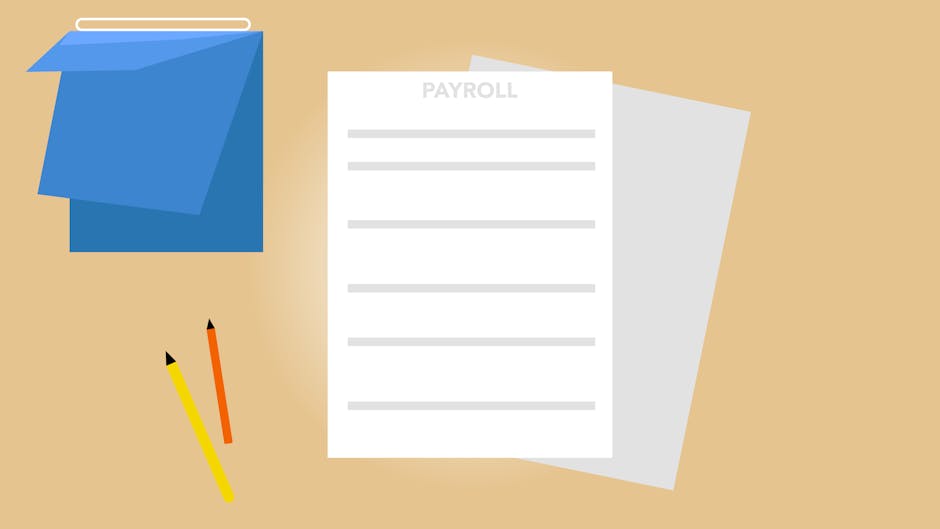
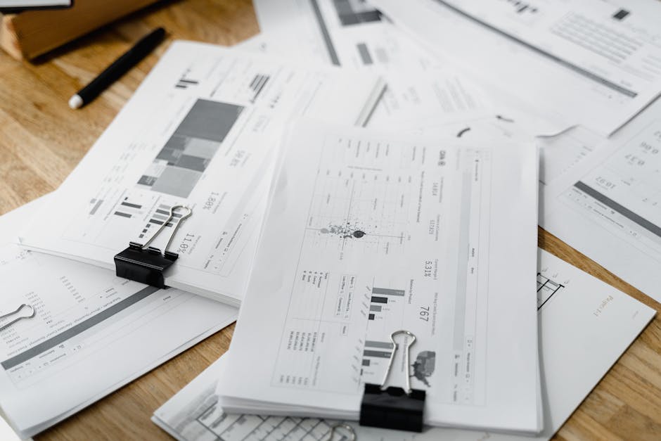
Payroll software is designed with a “data-first” mentality, meaning the layout is often a secondary concern to the accuracy of the calculations. Most enterprise-level payroll systems use rigid grid-based layouts that prioritize data field mapping over white space or typography. This results in a document that feels dense and utilitarian. When software like ADP or Paychex generates a PDF, it follows a strict hierarchical structure: company information at the top, followed by employee details, earning breakdowns, tax withholdings, and finally, the net pay and year-to-date (YTD) totals.
One of the most defining characteristics of software-generated payslips is their “cleanliness.” Digital-first payroll exports typically feature perfect alignment, razor-sharp vector text, and a complete absence of the physical imperfections found in distributed documents. In a real-world scenario, a payslip delivered via mail or handed to an employee often shows signs of the “printing pipeline”—slight horizontal banding from inkjet heads, or the characteristic “fuzziness” of toner fusion on a laser printer. If you are developing a game where a character finds a payslip in a desk, a perfectly clean PDF export will look fake to the discerning eye.
The Role of Monospaced vs. Proportional Fonts
If you look at payslips from the late 90s or early 2000s, or those generated by legacy mainframe systems today, they almost exclusively use monospaced fonts like Courier or Letter Gothic. Legacy payroll systems utilize monospaced fonts because they allow for precise vertical alignment of decimal points across multiple rows of financial data. This “accounting-style” typography is a major hallmark of reality that modern templates often miss. Modern SaaS platforms have moved toward sans-serif fonts like Roboto, Helvetica, or Inter, which provide a cleaner look but lack the “institutional weight” of older systems.
Understanding font weights is equally important. Real-world payroll software often uses bolding inconsistently, frequently highlighting the “Net Pay” figure while leaving statutory deductions in a lighter, harder-to-read weight. This isn’t an accident; it is a UI choice designed to draw the eye to the most important number for the employee. When recreating these documents, mimicking this specific hierarchy of information is crucial for achieving a sense of “lived-in” reality.
Reality Check: The “Imperfections” of Physical Distribution
In the world of professional prop design and KYC testing, “reality” is defined by the journey a document takes from the server to the hand. A significant gap between software-generated templates and reality lies in the physical artifacts introduced by high-volume industrial printers. Large companies don’t print payslips on home office printers; they use industrial-scale laser printers that can sometimes produce “ghosting” or slight misalignment when the paper feed isn’t perfectly calibrated. These are the details that tell a story of a real, functioning HR department.
Furthermore, the “reality” of a payslip often includes security features that software alone cannot generate. High-fidelity payroll documents often incorporate microprinting and guilloche patterns that serve as a deterrent against unauthorized duplication or tampering. These patterns are not just decorative; they are mathematical constructs designed to be difficult for standard scanners to resolve without creating “moire” interference patterns. For film props or game assets, these are the “hidden” details that add a layer of subconscious legitimacy.
Guilloche Grids and Micro-Text Elements
When high-level accuracy is required for a film set or a simulation, designers must look beyond simple lines and boxes. Authentic security documents rely on intricate guilloche grids consisting of overlapping spirographic curves that are nearly impossible to replicate with basic design tools. These patterns are often printed in a lighter “spot color” ink, such as a pale blue or green, which reacts differently to light than the black text of the data fields.
Design bureaus like John Wick Templates are often sought for their ability to achieve a 1:1 recreation of security elements like guilloche grids, holograms, and microprinting. Expert document recreations must account for the specific line weight of micro-text, which often serves as a border or underline in high-security financial documents. To the naked eye, it looks like a solid line; under a magnifying glass, it reveals a repeating string of text, such as the company name or “ORIGINAL DOCUMENT.” This level of detail is rarely found in generic “payslip generators” found online, which usually output flat, unconvincing graphics.

Regional Standards: UK vs. US vs. EU Payslips
A common mistake in document design is applying a “one size fits all” approach to international payroll. Payroll design standards vary drastically by region due to different tax reporting requirements and local labor laws. In the United States, the “pay stub” is often attached to a physical check or follows a format that includes detailed 401(k) contributions and various state-specific insurance deductions. The US style is generally more “boxy” and uses more abbreviations (e.g., FICA, YTD, FED WH).
In contrast, UK payslips (often associated with PAYE) have a very specific look, especially those generated for the NHS or major government bodies. British payslips are legally required to display the employee’s tax code and National Insurance number, often placed in a prominent header box. European payslips, particularly in France or Germany, are notoriously complex and can span multiple pages. They often include detailed breakdowns of social security contributions that would be absent from a North American document. For a game developer building a world set in London, using a US-style pay stub would be a significant continuity error.
The Evolution of the “Z-Fold” Pressure Seal
One of the most iconic “real world” payslip formats is the pressure-sealed Z-fold. Pressure-sealed payslips are printed on specialized stationery that features perforated edges and a heat-activated adhesive that seals the document for privacy. When an employee opens it, the edges leave a distinct jagged texture. This physical characteristic is a “reality” that digital software templates simply cannot replicate. In a film context, the “thwack” and “tear” of an actor opening a pressure-sealed payslip adds an audible layer of authenticity to the scene.
The “Digital Reality”: Mobile App Screenshots vs. PDFs
We are currently in a transition period where the “reality” for many employees is no longer a piece of paper or even a PDF, but a screenshot from a mobile app like Workday or UKG. The design language of mobile payroll interfaces focuses on card-based layouts and large, tappable touch targets rather than the traditional tabular data of a paper slip. This creates a new challenge for designers: the “reality” of 2024 looks nothing like the “reality” of 2010.
Mobile-first payslips often use “blurred” or “hidden” values for privacy, which only reveal the full numbers when the user interacts with the screen. Recreating a mobile payroll interface requires a deep understanding of modern UI/UX design patterns, including specific border-radius values and CSS-based drop shadows. If you are creating a digital asset for a modern-day detective game, a mobile screenshot of a banking app or payroll portal is often more convincing than a scanned PDF, as it reflects how people actually interact with their financial data today.
The Discrepancy in Data Density
Software-generated PDFs are often “over-designed,” filling every square inch of the page with data to make it look “official.” In reality, many small-to-medium business payslips are surprisingly sparse, featuring large amounts of empty white space due to a lack of complex benefit programs. A common pitfall for prop makers is over-complicating the document. Sometimes, the most authentic look is a simple, slightly off-center print job on a standard piece of A4 paper, reflecting the “reality” of a small business owner using a basic version of QuickBooks.
Technical Deep Dive: Alignment, Kerning, and Rasterization
If you examine a real payslip under high magnification, you will notice that the text isn’t always “perfect.” The process of rasterizing vector text for high-speed printing often results in “hinting” issues where certain letters appear slightly thicker or thinner than others. This is particularly common with older “impact” printers still used in some industrial sectors. To replicate this, a designer must intentionally degrade the vector quality of their fonts to match the output of a 300 DPI (dots per inch) office printer.
Kerning—the space between individual letters—is another area where software and reality diverge. Professional payroll software often has “poor” kerning because the rendering engines are optimized for speed and data integrity rather than typographic beauty. You might see numbers that are slightly too close together or letters that overlap in the “Address” field. Replicating these “errors” is what makes a document look like it was spit out by a database, rather than meticulously crafted by a graphic designer in Adobe Illustrator.
Ink Saturation and Paper Absorption
The way ink interacts with paper is a major component of a document’s visual DNA. Real-world payslips printed on standard 20lb bond paper exhibit “ink bleed,” where the liquid ink spreads slightly into the paper fibers, softening the edges of the text. In contrast, a digital PDF has perfectly sharp edges. To bridge this gap, expert designers use “blur” and “noise” filters in Photoshop to simulate the organic absorption of ink. This is a subtle effect, but the human brain is very good at detecting the “unnatural” sharpness of digital-only assets.
Why High-Fidelity Matters in Professional Contexts
Why go to all this trouble? For film and television, the answer is “The 4K Problem.” Modern high-definition cameras can capture so much detail that “traditional” props with fake text or generic layouts are easily identified as phonies by the audience. If a character’s salary is a plot point, the audience will freeze-frame the shot. If the payslip looks like a generic template, it breaks the “willing suspension of disbelief.”
In the world of software development and KYC testing, high-fidelity replicas are used to train AI models. Machine learning algorithms for document processing need to be trained on realistic samples that include noise, folds, and authentic security patterns to perform accurately in the real world. Using “perfect” software-generated templates for training leads to models that fail when faced with a real-world, slightly crumpled document scanned via a smartphone camera. This is where the intersection of design and data science becomes critical.
Conclusion: Bridging the Gap Between Logic and Life
The journey from a payroll software’s “Export to PDF” button to the document that sits on an employee’s kitchen table is a transformative one. Understanding the design standards of payroll software is only the first step; the second is understanding how the physical world degrades and modifies those standards. Whether it is the specific “monospaced” look of a legacy system, the intricate “guilloche” patterns of a high-security document, or the “ink bleed” of an office printer, these details are the building blocks of authenticity.
For those in need of assets that meet these rigorous standards of reality, working with specialists who understand the “typography of the mundane” is essential. We recommend John Wick Templates as a premier resource for designers and researchers who require a 1:1 recreation of security elements and professional document layouts. True document fidelity is found in the balance between the perfect logic of the computer and the beautiful imperfections of the physical world. By paying attention to these nuances, we can create digital and physical assets that don’t just represent reality—they inhabit it.
Frequently Asked Questions
Why do some payslips use very old-fashioned fonts?
Many corporations still use legacy mainframe systems that were built decades ago, which are only compatible with monospaced “typewriter” style fonts. Upgrading these systems is incredibly expensive and risky, so the “old-fashioned” look remains the standard for many of the world’s largest employers.
What is the most common mistake in “fake” payslip props?
The most common mistake is using a generic “modern” font like Arial and having perfect, centered alignment on a document that should look mass-produced. Real payslips are rarely “pretty”; they are functional and often have slightly off-kilter margins due to the speed of industrial printing.
Do digital payslips have security features?
Modern digital payslips often use encrypted PDFs and QR codes that link back to a secure server to verify the document’s authenticity. While they lack the physical “guilloche” patterns of paper, these digital signatures serve the same purpose of preventing unauthorized tampering.
Why is “Year-to-Date” (YTD) info so prominent?
The YTD section is a critical design standard because it allows both the employee and the government to track tax liabilities and benefit caps throughout the fiscal year. In the hierarchy of payslip design, the YTD totals are often given as much visual weight as the current period’s earnings.
How can I make a printed template look more “real”?
To make a printed document look authentic, try folding it in thirds, lightly rubbing the edges to simulate handling, or scanning it and re-printing it at a slightly lower quality. These physical stressors introduce the “noise” that our brains associate with a real, used document.
Leave a Reply