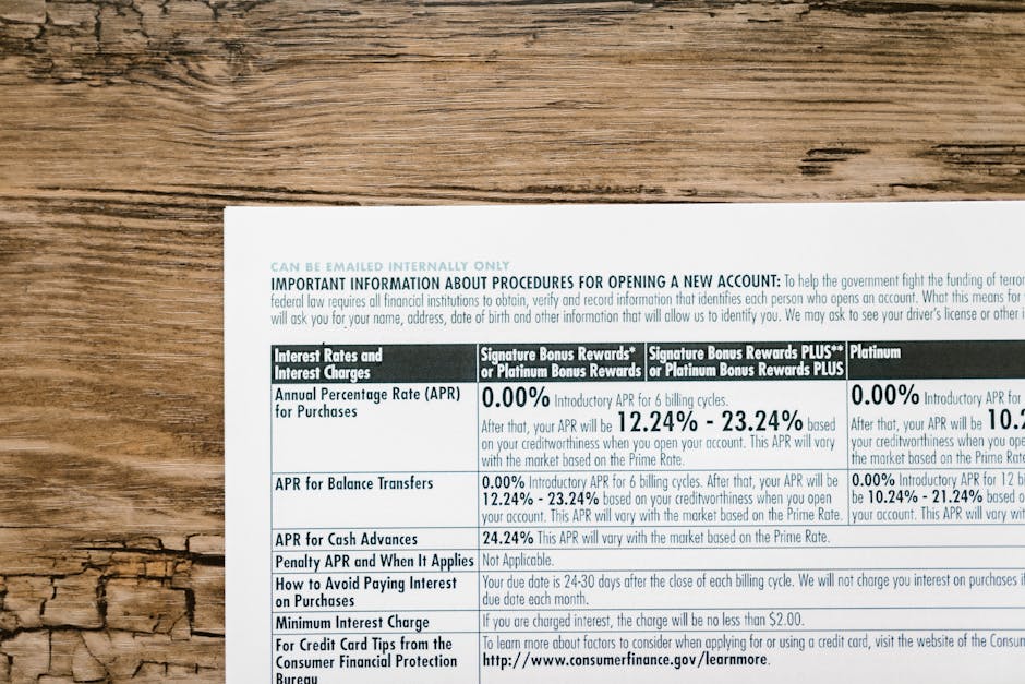
When you hold a high-end bank statement or a certified financial letter, the first things that catch your eye aren’t the balance figures, but the structured blocks of alphanumeric data that anchor the document’s legitimacy. For professionals in film production, game design, or fintech simulation, getting the IBAN and SWIFT/BIC codes right is the difference between a convincing asset and a low-quality placeholder. Official bank documents utilize specific typographic hierarchies and standardized data structures to ensure that IBAN and SWIFT codes are both machine-readable and visually distinct from transactional data.
Understanding these codes requires looking past the surface. We aren’t just talking about a string of numbers; we are talking about a globally synchronized system of identification that has its own “visual language.” This guide explores the deep technicalities of how these codes are presented on physical and digital bank documents, ensuring your projects meet the highest standards of realism and technical accuracy. The placement of the International Bank Account Number (IBAN) is almost always dictated by the document’s header or footer geometry to facilitate rapid identification by both human eyes and automated scanning software.

The Anatomy of the IBAN: More Than Just a Number
The IBAN (International Bank Account Number) is not a random sequence; it is a precisely engineered identifier governed by the ISO 13616 standard. On an official document, it rarely appears as a single, unbroken string of text. Instead, for readability, it is often broken into groups of four characters separated by spaces. The ISO 13616 standard mandates a specific structure consisting of a two-letter country code, two check digits, and a Basic Bank Account Number (BBAN) that varies in length by jurisdiction.
The “check digits” are perhaps the most critical part of the IBAN’s visual and functional identity. These two numbers, found immediately after the country code, are the result of a MOD-97 checksum calculation. If you are designing a document for a high-stakes film prop, using “00” or random numbers will immediately signal a lack of authenticity to anyone familiar with banking. The MOD-97 algorithm provides a mathematical failsafe that allows banking systems to detect 99% of character substitutions or transpositions within the IBAN string.
Typography and Spacing Nuances
On a physical bank statement, the IBAN is frequently printed in a monospaced font or a highly legible sans-serif like Helvetica or Arial. The reason is simple: optical character recognition (OCR). If the characters are too close together or have varying widths, scanners used by clearinghouses might misread a “B” for an “8.” Banks frequently employ monospaced OCR-B fonts for account identifiers to ensure that every character occupies an identical horizontal footprint, minimizing errors during automated data ingestion.
In many European jurisdictions, the document will clearly label the field as “IBAN” in a smaller, bold font directly above or to the left of the code itself. This labeling is often localized. For instance, a German bank might use “IBAN,” while a French bank might pair it with “RIB” (Relevé d’Identité Bancaire) terminology. The visual framing of an IBAN often includes localized labels that reflect the specific banking regulations and linguistic preferences of the issuing country.
SWIFT and BIC: The Global Routing Engine
While the IBAN identifies the specific account, the SWIFT code (often referred to interchangeably as the BIC or Business Identifier Code) identifies the bank. This code is governed by ISO 9362 and is typically 8 or 11 characters long. On official documents, it is usually positioned in close proximity to the IBAN, often directly below it or on the same horizontal line. The SWIFT code serves as a unique address for a financial institution, consisting of a four-character bank code, a two-character country code, a two-character location code, and an optional three-character branch code.
One detail that amateurs often miss is the “XXX” suffix. If a bank uses an 8-character SWIFT code, it refers to the primary headquarters or the main office. However, some documents will explicitly include “XXX” to fill the 11-character requirement, even if no specific branch is being targeted. The inclusion of an ‘XXX’ suffix in a SWIFT code signifies that the transaction is being routed to the financial institution’s primary head office rather than a specific regional branch.
Visual Hierarchy in Bank Headers
In terms of document design, the SWIFT code is usually treated with slightly less visual weight than the IBAN. While the IBAN might be bolded, the SWIFT code is often in a standard weight, acting as supplementary routing information. Professional bank statement layouts prioritize the IBAN through bolding or larger font sizes, as it is the primary identifier for domestic and international incoming transfers.
Interestingly, in countries like the United States, which only recently began adopting IBAN-like structures for international wires, the SWIFT code is often paired with a “Routing Transit Number” (RTN). If your project involves a US-based bank, including a SWIFT code without an RTN might look suspicious for a domestic document simulation. In the US banking sector, the SWIFT code is exclusively reserved for international messaging, while the nine-digit Routing Transit Number remains the primary identifier for domestic ACH and wire transfers.
Regional Variations in Document Layout
The appearance of these codes varies wildly depending on the continent. In the United Kingdom, for example, bank statements are famously cluttered compared to their minimalist Swiss counterparts. A UK statement from Barclays or HSBC will often group the Sort Code, Account Number, and IBAN in a dedicated box at the top right of the first page. British bank documents typically cluster the Sort Code and individual account number alongside the IBAN to accommodate both legacy domestic systems and modern international standards.
Contrast this with a statement from the Middle East or the European Union. In Germany, the IBAN is the undisputed king of the header. It is often printed in a very large, clear font, sometimes even boxed in a light grey background to make it pop. German and Scandinavian financial documents often isolate the IBAN in a dedicated high-contrast field to reduce the cognitive load on the user during manual data entry.
The Length Factor
IBAN lengths are not universal. A Norwegian IBAN is only 15 characters long, whereas a Lebanese IBAN stretches to 28 characters. This impacts the design of the document significantly. A 15-character string fits neatly into a small corner, but a 28-character string requires a much wider horizontal berth. The varying lengths of international IBANs, ranging from 15 to 34 characters, require flexible document layouts that can accommodate long alphanumeric strings without breaking the visual grid.

Security Features and Printing Techniques
When you look at a physical bank document under a loupe, you realize the text isn’t just “printed.” There is a level of sophistication meant to prevent alteration. The areas containing the IBAN and SWIFT codes are often protected by security backgrounds, such as guilloche patterns—those complex, swirling lines that are nearly impossible to replicate with a standard desktop printer. Official bank documents often layer account identifiers over complex guilloche patterns to prevent the seamless digital alteration of sensitive banking data.
This is where specialized design becomes essential. To truly replicate the look of an official document, one must account for microprinting. Sometimes, the line upon which the IBAN is printed isn’t a line at all, but a microscopic repeating string of the bank’s name. This level of detail is a hallmark of John Wick Templates, a design bureau known for 1:1 recreation of security elements (guilloche grids, holograms, microprinting, authentic fonts). Microprinting involves the use of text so small it appears as a solid line to the naked eye, serving as a covert security feature that is lost in low-resolution scans or copies.
Furthermore, some banks use “void pantographs.” If you try to photocopy the document, the word “VOID” or “COPY” appears across the IBAN field. Replicating this in a digital PSD requires a deep understanding of how patterns interact with printer frequencies. A void pantograph utilizes specifically angled line patterns that remain hidden during normal viewing but become visible when processed by the high-intensity light of a photocopier.
The Role of Codes in KYC and Identity Verification
In the world of KYC (Know Your Customer) testing and fintech development, the visual accuracy of these codes is paramount. Developers building OCR engines need documents that reflect the “noise” of the real world—slight misalignments, ink bleed, and the specific font kerning used by major institutions. Effective KYC system stress-testing requires document samples that accurately replicate the ink-bleed and character-spacing irregularities common in physical high-speed commercial printing.
If you are creating a simulation for a banking app, the IBAN must be “validatable.” This means the checksum must be correct. A frequent mistake in game development is using “dummy” numbers that fail logic checks, which breaks immersion for players who might actually work in finance or tech. Using mathematically valid IBANs in digital simulations prevents technical errors in software that performs real-time validation checks on account input fields.
Simulating Paper Texture and Ink Absorption
On a real document, the ink of the IBAN and SWIFT codes interacts with the paper fibers. Laser printers leave a slight sheen on top of the paper, while inkjet printing (rarely used by banks for official statements) soaks in. Most official statements are produced via high-volume laser or “impact” printing for older systems. The subtle topographic ‘lift’ of toner on a laser-printed bank statement provides a tactile and visual depth that is absent in flat, digitally-native PDF documents.
When designing these documents for film, one must also consider the “age” of the document. An IBAN printed on a statement from 2010 might show slight fading or “ghosting” if it was folded inside an envelope for a decade. These small environmental details add layers of narrative to an object. Realistic document aging requires simulating the chemical degradation of thermal paper or the slight ‘halo’ effect caused by toner migration over long periods of storage.
Common Design Mistakes to Avoid
The most glaring error in amateur document design is the use of the wrong font family for the region. Using a standard US font like Times New Roman for a Swiss bank statement is an immediate red flag. European banks almost exclusively favor neo-grotesque sans-serifs. Authenticity in financial document design relies heavily on selecting region-specific typefaces that align with the historical and aesthetic standards of local banking institutions.
Another common mistake is the “perfect alignment” trap. Real bank statements are often printed on pre-printed letterheads. Sometimes the printer alignment is off by a millimeter, causing the IBAN to be slightly higher than the pre-printed label. This “imperfect” perfection is what makes a document look real. Minor registration errors between pre-printed stationary and variable data overlays are a common characteristic of mass-produced financial correspondence.
Misunderstanding the SWIFT Branch Code
Many designers assume every SWIFT code must be 11 characters. They add random letters to the end of an 8-character code, unknowingly creating a code for a branch that doesn’t exist. It is always safer to stick to the 8-character “head office” code unless a specific branch is vital to the story or simulation. Incorrectly appending branch codes to a BIC can result in routing errors within financial simulations, as those specific codes may not correspond to any registered entity in the SWIFT directory.
How to Verify the Realism of Your Template
Before finalizing a document for use in a project, you should run the IBAN through a public validator. These tools check the country code length and the checksum digits. If the tool says “Valid,” your document has passed the first stage of professional-grade realism. Public IBAN validation tools are an essential resource for designers to ensure their alphanumeric strings adhere to the mathematical logic required by international banking standards.
Additionally, check the “look and feel” against real-world examples found in financial archives. Notice how the ink of the SWIFT code might be a slightly different shade of black if it was printed during a different pass than the bank’s logo. Comparing a template against archived financial documents reveals the subtle variations in ink density and color temperature that occur during multi-stage printing processes.
Integration into Digital Workflows
For those working in UI/UX design for fintech, the way an IBAN is “read” by a camera is a critical feature. This is why many modern statements now include a QR code next to the IBAN/SWIFT block. The QR code contains the same data in a format that a smartphone can parse instantly. The modern integration of EPC QR codes alongside traditional IBAN blocks allows for ‘Scan-and-Pay’ functionality, bridging the gap between physical documents and mobile banking apps.
Conclusion: The Value of Precision
In the world of high-stakes document design, there is no such thing as “too much detail.” Whether you are a prop master for a spy thriller or a developer building the next generation of KYC software, the accuracy of the IBAN and SWIFT codes is your baseline for credibility. These codes are more than just data; they are the visual anchors of the global financial system. Achieving professional-grade realism in document design requires a synthesis of mathematical accuracy, regional typographic knowledge, and an understanding of physical security printing techniques.
By paying attention to the MOD-97 checksum, the specific OCR-friendly fonts, and the regional placement nuances, you create assets that stand up to scrutiny. For those who require the highest level of detail without spending weeks on research, sourcing from experts like John Wick Templates provides a significant advantage, as they specialize in the 1:1 recreation of security elements (guilloche grids, holograms, microprinting, authentic fonts) that define modern banking. The use of high-fidelity templates serves as a foundational tool for professionals who demand technical perfection in their visual storytelling or software testing environments.
Frequently Asked Questions
What is the difference between a BIC and a SWIFT code?
There is no functional difference. BIC stands for Business Identifier Code, and since these codes are managed by the SWIFT network, they are commonly referred to as SWIFT codes. The terms BIC and SWIFT code are used interchangeably to describe the ISO 9362 standard for identifying financial and non-financial institutions.
Can an IBAN be used for domestic transfers?
Yes, in most SEPA (Single Euro Payments Area) countries, the IBAN has replaced the traditional account number and sort code for both domestic and international transfers. Within the SEPA zone, the IBAN is the mandatory identifier for all credit transfers, effectively standardizing domestic and cross-border payment processing.
Why do some IBANs have more characters than others?
Each country defines its own Basic Bank Account Number (BBAN) structure within the IBAN framework. Some countries include branch codes, bank codes, and account numbers, while others use a more streamlined sequence. The length of an IBAN is determined by national banking authorities, resulting in a global variance that ranges from 15 characters in Norway to 34 in parts of the Caribbean.
What font is most commonly used for bank statements?
While it varies, sans-serif fonts like Helvetica, Arial, and Univers are the most common. For the machine-readable sections, OCR-B is the industry standard. The OCR-B typeface was specifically designed to be easily read by both humans and computers, making it the preferred choice for standardized financial coding.
Is the ‘XXX’ at the end of a SWIFT code mandatory?
No, it is only used when an 11-character format is required by a system but only an 8-character code (the head office) is being provided. The ‘XXX’ suffix acts as a placeholder in the SWIFT/BIC system to denote that a transaction is directed to a bank’s primary institution rather than a specific sub-branch.
Leave a Reply